Be Happy Yoga
| BRANDING | LOGO | TEMPLATES | WEBSITE DESIGN

“Claire has done an absolutely brilliant job of rebranding my yoga studio and helping me to create an identity that 1) reflects my business values and ethos as a wellbeing entrepreneur and 2) that I feel really proud of.”
Client
Leslie Muir founded Be Happy Yoga in 2017 and opened her garden studio in 2021. Her mission is to make yoga genuinely inclusive and accessible, offering everything from weighted yoga to chair yoga.
We connected through the Digital Mother community run by Emma Peries (who I have also done branding work for).

Brief
Leslie designed her original studio logo in haste – using chakra colours and a dancer pose because it ‘felt yogic’. But as her studio grew, so did her mission. Her business had evolved into a community-centred, inclusive space focused on health and ageing well — and her DIY branding no longer reflected it.
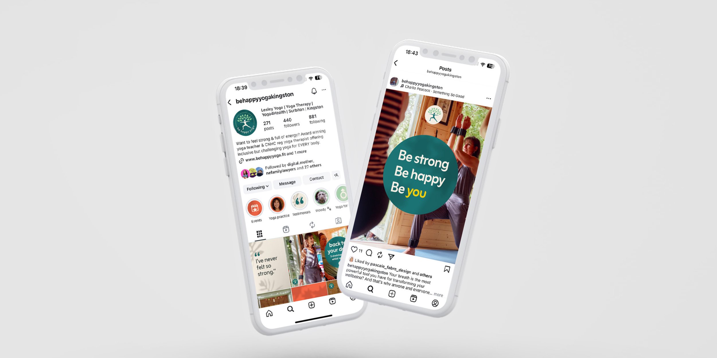
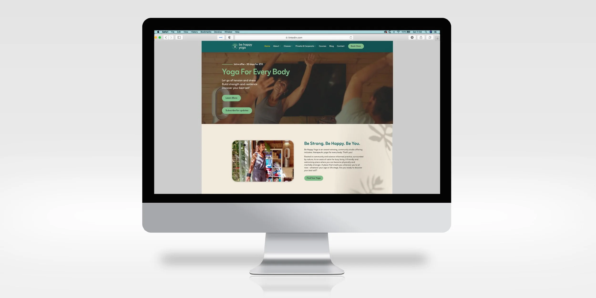
She needed a refreshed brand identity: a redesigned logo, strong guidelines, and a visual identity to use in her marketing across social media and print. She also needed visual direction for her new WordPress website built by Erild Kochata at Able Web Services.


Creative
Before we worked together, Leslie collaborated with MBA students from Kingston University to clarify her vision and really niche down on her ideal audiences. When thinking about the inclusivity of Leslie’s approach and the wide span of ages within her clientele, the idea of linking to the seasons emerged.
Leslie’s garden studio is a beautiful space, surrounded by well-established trees and feeling very grounded in nature. Attending Be Happy Yoga becomes an experience, rooted in community, rather than simply a yoga class.
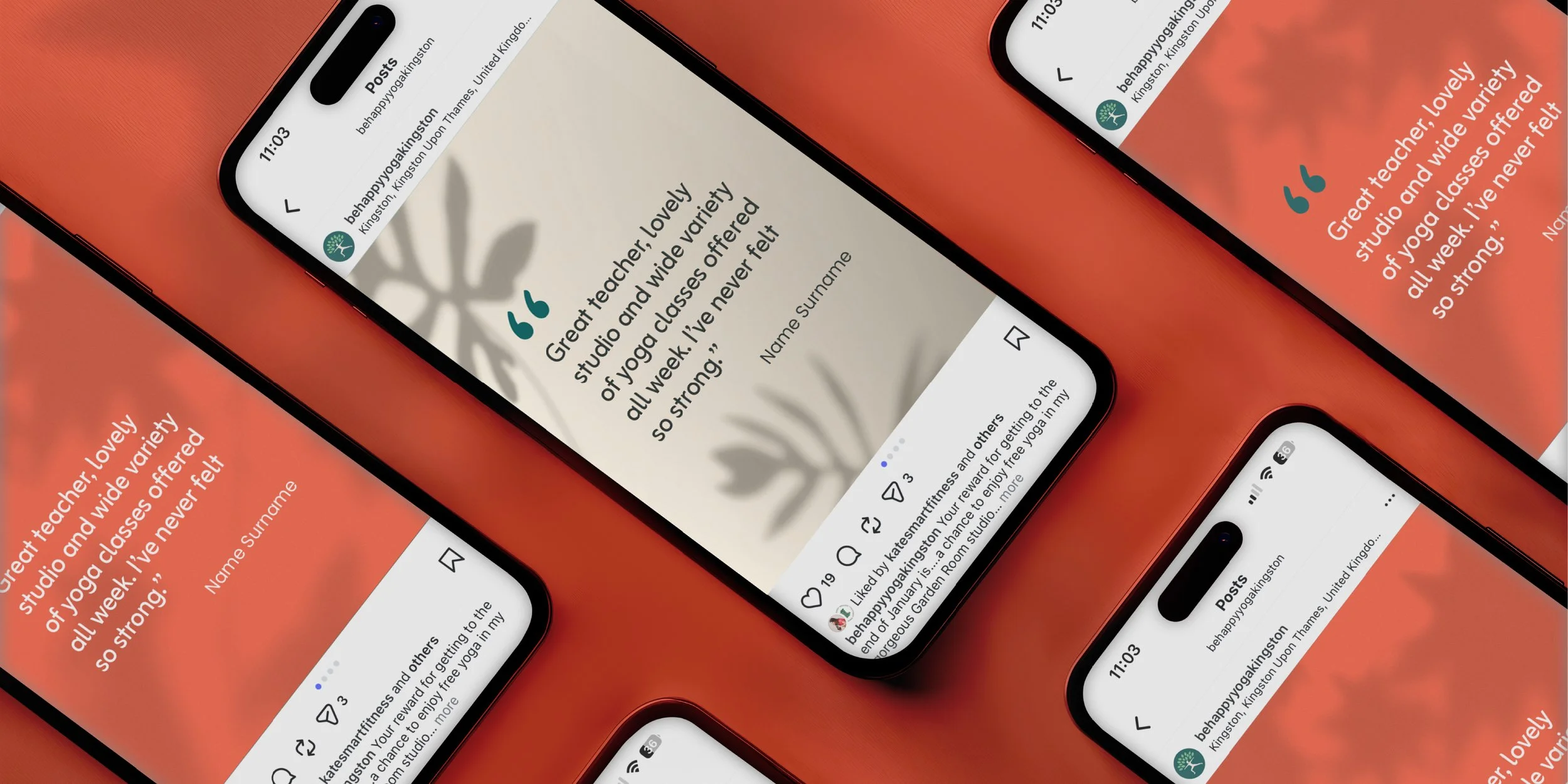
Photographer Olivia Spencer captured beautiful images of Leslie teaching in her studio, and these inspired the visual direction: using the shadows from nature as background imagery and incorporating the colours into the natural, seasonal colour palette. The aesthetic I produced plays on the physical space that Leslie has created with a calm, centred feeling. The background and colours change according to the seasons, representing an evolving brand that is rooted in nature and adapts to the seasonal changes within the space.
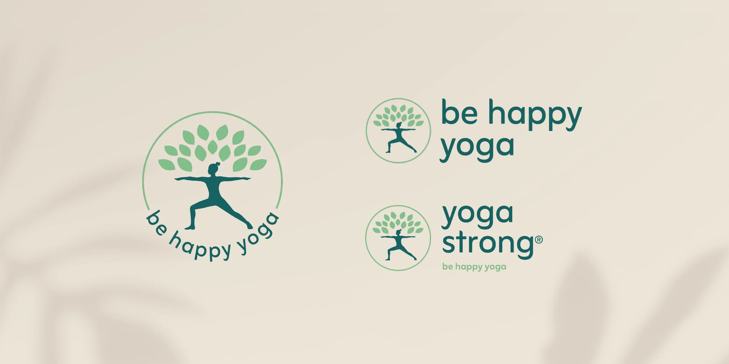
The logo redesign included a new yogi figure that could be a man or a woman. Leslie picked the Warrior 2 pose to symbolise strength and groundedness but also because it’s a very adaptable and accessible posture. The leaves symbolise the tree of life and constant renewal, as well as Leslie’s close-knit class community and focus on whole-body wellbeing rooted in nature.
As well as creating the overall visual identity and toolkit for social media and marketing, I mocked up a homepage for the web developers to use when creating Leslie’s new website.


Impact
Leslie now has a complete, cohesive brand toolkit — logo, colour palette, fonts, icons and Canva templates — which she uses across her website and marketing channels.
When she launched her new branding and website (now complete with a new booking system), her clients immediately connected with the fresh look and feel. Leslie says the identity finally aligns with her values, and she’s been consistently creating on-brand content using the templates I created for her.
Leslie was so pleased with the overall results she wrote a blog about the whole rebranding process.
“I never had a brand identity that reflects me and that I’m proud of before and it makes such a difference on so many levels. Thank you for your fantastic work :-).”

